Mercator vs Equal Earth Projection: Why the UN Voted to Correct the World Map
The UN General Assembly voted 164 to 1 for the "Correct the Map" resolution, asking schools, media and tech platforms to prefer the Equal Earth projection over Mercator when size matters. The geometry behind the distortion, the equal-area family compared, the politics of the vote, and how to study map projections for UPSC.
Most of us learned the world from a classroom wall map on which Greenland sat across the Atlantic looking like a fair match for Africa. It is not a fair match. Africa is about 14 times larger. The Mercator vs Equal Earth projection argument is about that one illusion and everything it quietly teaches, and on Friday, 4 September 2026, the UN General Assembly picked a side. By 164 votes to 1, with 6 abstentions, it adopted a resolution titled Correct the Map, which asks governments, schools, media and technology companies to use the Equal Earth projection or another equal-area map whenever the relative size of countries matters.
The vote changes no coastline and no border. What it changes is the default picture in a textbook, and for an aspirant the story sits on top of a piece of geometry that is worth understanding properly once, because it explains every “why does this map look wrong” question you will ever meet.
What the Correct the Map resolution actually says
The resolution is a recommendation, not a rule. It is non-binding, it bans nothing, and it leaves the Mercator projection untouched for the job it was built for, which is navigation. What it does is name a preferred alternative and ask institutions to use it in the places where a map is read as a picture of the world rather than as a tool for steering a ship.
The facts of the vote:
- Adopted on 4 September 2026 by the UN General Assembly, 164 in favour, 1 against, 6 abstentions.
- Introduced by Togo, through Foreign Minister Robert Dussey, on behalf of the African group, carrying the African Union’s campaign into the Assembly.
- The lone vote against was the United States. Ambassador Mike Waltz called the initiative part of a “radical ideological project” and said resolutions like it were “barnacles” on the Assembly’s work, objecting in particular to its references to reparations and “cognitive justice”.
- Six abstentions: Estonia, Georgia, Lithuania, Moldova, Serbia and Ukraine.
- What it encourages: use of Equal Earth and other equal-area projections in schools, textbooks, newsrooms, international organisations and digital platforms “when relative size matters”, along with teaching the limitations of every projection.
- What it protects: Togo’s foreign ministry stated that the text “in no way challenges” Mercator for maritime and aerial navigation.
Two things happened around the vote that matter as much as the tally. Hours before it, French Foreign Minister Jean-Noël Barrot announced that Paris would move its own world maps off Mercator. And Togo said it hopes to change its school geography materials by the end of the year, then press other governments and technology companies to follow.
The campaign behind the resolution has a longer history than the vote suggests. Correct the Map is run by two advocacy groups, Africa No Filter, whose executive director Moky Makura has fronted it, and Speak Up Africa. The African Union endorsed it in August 2025, and the Caribbean Community backed it too. Their argument is that a map which shrinks Africa to the size of Greenland, when the continent could hold the United States, China, India, Japan and most of Europe at once, has spent centuries teaching people that Africa is peripheral. The graphic designer Kai Krause made the same point in 2010 with a single image titled The True Size of Africa, and it has been circulating in classrooms ever since.
Dussey put the case in one line: “A fair map does not change the geography of the world, it changes how we see the world.” Whether you agree that a projection carries that much moral weight is a fair question, and the section on the politics below takes it seriously. The geometry, though, is not in dispute.
Why the Mercator projection makes Greenland look like Africa
Mercator stretches the map more and more as you move away from the equator, and it stretches in both directions at once, so areas near the poles balloon. That is the whole mechanism. Everything else is detail.
Look at the two maps below before reading the maths. Both are drawn by the cartographer Daniel R. Strebe from the same NASA Blue Marble satellite imagery with a 15° graticule, so the only thing that differs between them is the projection. On the first, Greenland rivals Africa and Antarctica is a wall along the bottom. On the second, Greenland shrinks to an island and Africa is the largest thing in the southern half of the map, which is what it is.
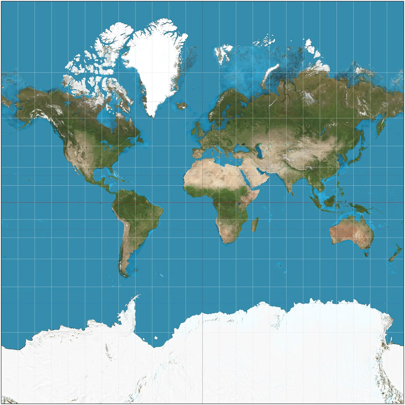

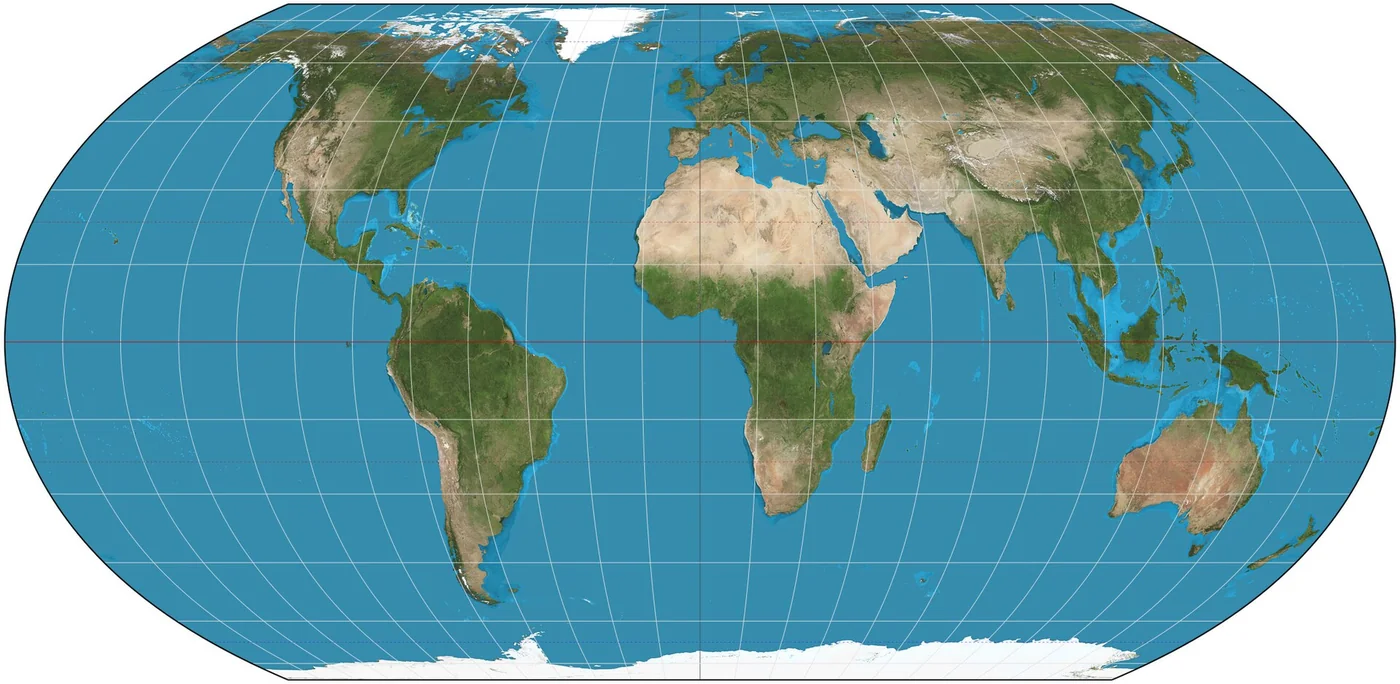

Gerardus Mercator, a Flemish cartographer, published his world chart in 1569 for sailors. He wanted one property above all others: a ship holding a constant compass bearing should trace a straight line on the map. Such a constant-bearing course is called a rhumb line, or loxodrome, and on a globe it is a spiral. To make it straight on paper, Mercator had to keep angles true everywhere, which is the property cartographers call conformal. A conformal map keeps every small shape correct, which is exactly what a navigator reading angles off a chart needs.
The price of keeping angles true is that the map must stretch north-south by the same factor it already stretches east-west. On a cylinder wrapped around the equator, the east-west stretch at any latitude is 1 divided by the cosine of that latitude. Mercator applied the same factor vertically. So the area of anything drawn on the map is inflated by that factor squared.
Put numbers on it and the illusion falls apart:
- At the equator the factor is 1. Africa, which straddles the equator, is drawn at close to its true size.
- At 60° north (Oslo, Helsinki, southern Greenland), cos 60° is 0.5, so lengths are doubled and areas are multiplied by 4.
- At 70° north (central Greenland, the North Cape), areas are multiplied by roughly 8.5.
- At 80° north the multiplier is about 33, and at the pole itself it is infinite, which is why a Mercator map has to be cut off before it reaches the poles and why Antarctica appears as a white slab along the bottom edge.
If your instinct says Greenland is perhaps a third the size of Africa, you are closer than most people, and still far off. Greenland covers about 2.17 million km². Africa covers about 30.4 million km². The ratio is 1 to 14, and a Mercator map, by inflating Greenland roughly tenfold, hides almost all of it.
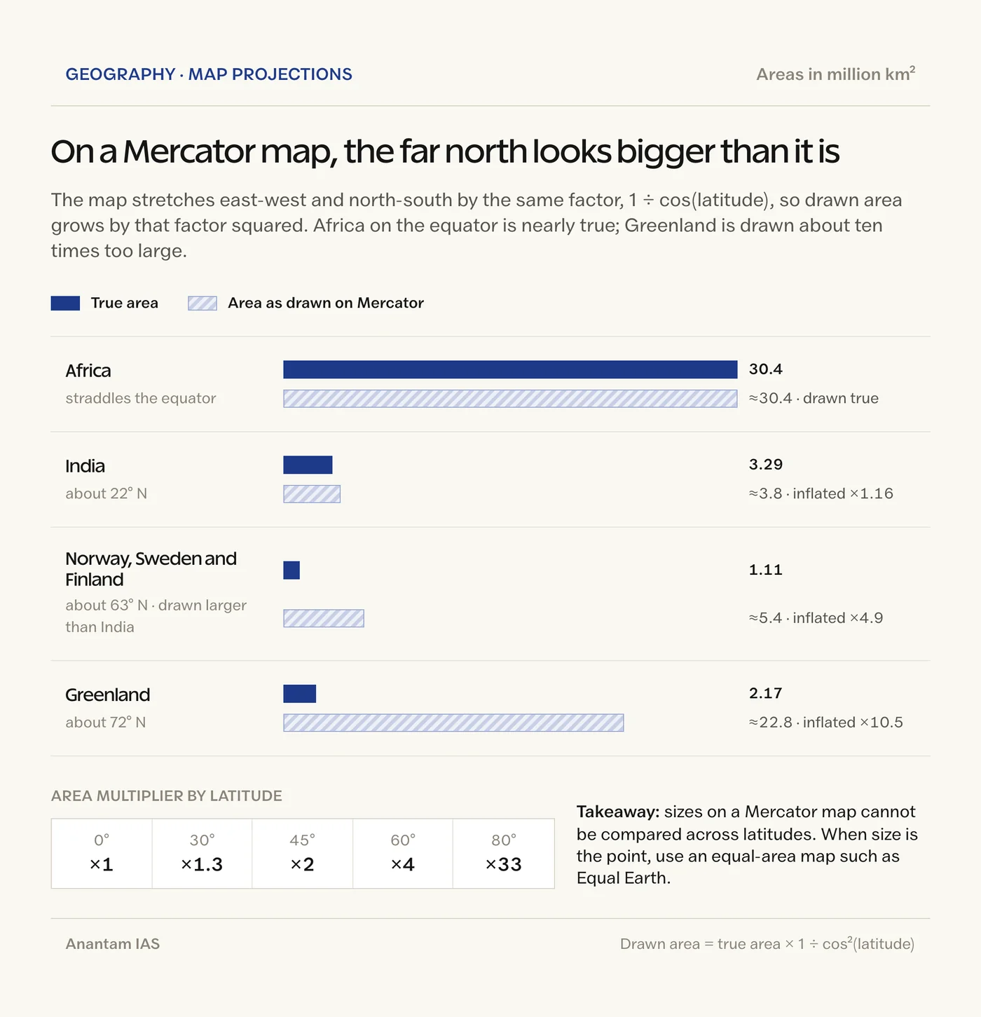
The same trick works on India. India’s 3.29 million km² is nearly 3 times the combined area of Norway, Sweden and Finland, which together cover about 1.1 million km². Because India sits near 22° north, Mercator inflates its area by only about 16 percent. The Nordic block sits near 63° north and is inflated nearly fivefold. On the wall map, the smaller region looks like the larger one. That is not a fault in your eye. It is a property of the projection.
One more thing to settle before moving on, because this trips up almost everyone: Mercator is not wrong. It does precisely what it was designed to do, and no equal-area map can do that job. The complaint is about using a navigation chart as a picture of the world, in a classroom, on a news broadcast, or as the base layer of the map on your phone. Phone maps use a variant called Web Mercator because it tiles neatly and keeps street shapes correct at every zoom. Google’s desktop maps switched to a spinning globe when zoomed out in August 2018, precisely so that Greenland would stop looking like Africa, while the mobile app still shows the flat version.
Equal Earth, Eckert IV and Gall-Peters: the equal-area family compared
The resolution names Equal Earth, a projection published in 2018, rather than the older equal-area maps you may have seen argued about, so the Mercator vs Equal Earth projection contest is really Mercator against the whole equal-area family with one modern representative chosen to front it. The reason is appearance. All equal-area projections get the sizes right; they differ in how badly they distort shapes to do it, and Equal Earth was designed to look familiar while keeping area honest.
An equal-area projection (cartographers also say equivalent) keeps the ratio of areas true everywhere: a country that is twice the size of another is drawn with twice the ink. The mathematics forces a trade. Once area is fixed, angles cannot also be kept true, so shapes get sheared or squashed somewhere, and the designer’s real choice is where to put the damage.
| Projection | Year and designer | Family | Keeps | Cost | Where you meet it |
|---|---|---|---|---|---|
| Mercator | 1569, Gerardus Mercator | Cylindrical, conformal | Angles and small shapes; rhumb lines are straight | Area balloons toward the poles; poles cannot be shown | Marine and aviation charts, Web Mercator on phone maps |
| Gall-Peters | 1855, James Gall; popularised 1973 by Arno Peters | Cylindrical, equal-area | Area | Shapes stretched tall near the equator, squashed near the poles | Boston Public Schools since March 2017, UNESCO-era posters |
| Eckert IV | 1906, Max Eckert | Pseudocylindrical, equal-area | Area; rounded outline with semicircular outer meridians | Shape distortion at the map’s outer edges | Thematic atlases, statistical world maps |
| Robinson | 1963, Arthur Robinson | Pseudocylindrical, compromise | Nothing exactly; everything approximately | Areas still inflated at high latitudes | National Geographic 1988 to 1998, many school atlases |
| Winkel Tripel | 1921, Oswald Winkel | Modified azimuthal, compromise | Low overall distortion of area, distance and direction | Not equal-area; curved parallels | National Geographic since 1998 |
| Equal Earth | 2018, Bojan Šavrič, Tom Patterson and Bernhard Jenny | Pseudocylindrical, equal-area | Area, with a Robinson-like familiar outline | Mild shape distortion at the edges | NASA since 2018, World Bank static maps, the UN resolution |
Read the last two rows together and the design logic is obvious. Robinson is the map most people find “normal”, but it lies about size. Equal Earth was built to look like Robinson without the lie. Its three authors published it in the International Journal of Geographical Information Science in 2018, and their stated trigger was Boston Public Schools adopting Gall-Peters in March 2017, a map that gets area right and makes Africa look like it has been pulled through a mangle. NASA used Equal Earth for a global temperature map within weeks of publication.
You will see Eckert IV named in some commentary on the vote, and it is a perfectly good equal-area map, more than a century old, with a distinctive rounded outline. The resolution text, however, names Equal Earth, and the campaign has promoted Equal Earth throughout. Treat Eckert IV as the older cousin in the same family, not as the projection the Assembly endorsed.
Every flat map lies: the four properties no projection keeps together
A sphere cannot be flattened without distortion. Carl Friedrich Gauss proved this in 1827 with a result he named the Theorema Egregium, the “remarkable theorem”, and it is the reason the question is never “which map is correct” but “which property does this map protect”.
The orange-peel analogy is the honest one. Peel an orange and press the peel flat. It tears or it stretches, and where you allow the tears and the stretching is your choice. The analogy holds well for the big idea. It breaks in one place: a mathematician can choose the stretching so precisely that one property survives perfectly, which no orange peel allows.
The four properties a map can protect are:
- Area, called equal-area or equivalent. Equal Earth, Eckert IV, Gall-Peters and the cylindrical equal-area projection keep it.
- Shape, called conformal or orthomorphic, meaning angles are true at every point. Mercator keeps it. So do the Lambert conformal conic and the stereographic projections.
- Distance, called equidistant, which can only be true from one or two points or along certain lines, never everywhere. The azimuthal equidistant projection keeps distances true from its centre, which is why the UN emblem, centred on the North Pole, uses it.
- Direction, called azimuthal, meaning bearings from the centre point are true. Any projection built on a flat plane touching the globe has it.
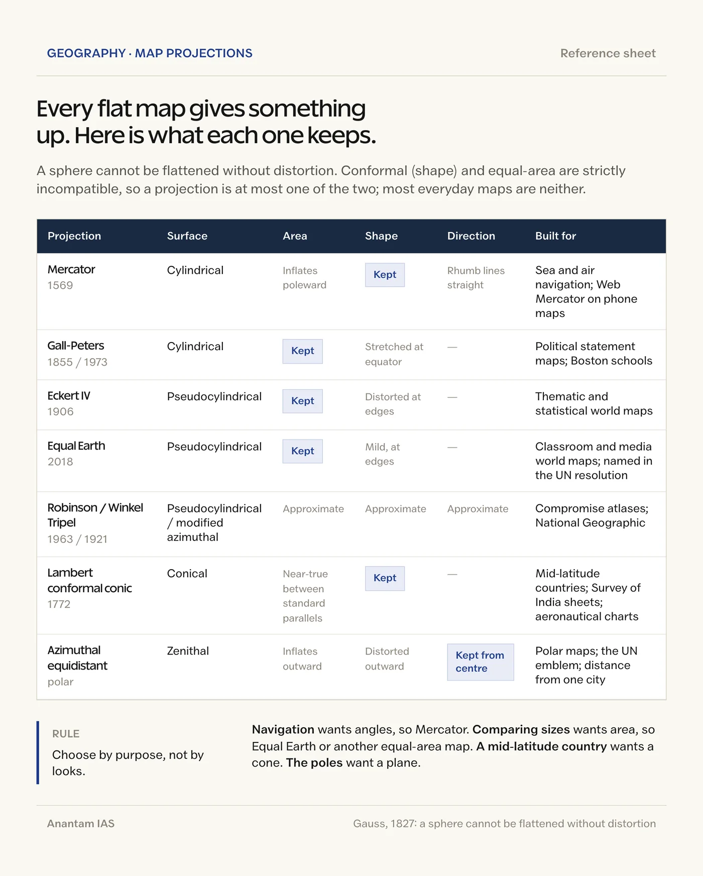
No projection keeps all four. Conformal and equal-area are strictly incompatible, so a map is at most one of the two, and most of the maps people like are neither, having traded a little of each for a familiar look. The French mathematician Nicolas Tissot gave cartographers a way to see the damage in 1859: draw a small circle on the globe, project it, and see whether it comes out as a circle (shape kept), an ellipse of the same area (area kept), or something else. Those little ellipses, Tissot’s indicatrix, are printed on the Mercator and Equal Earth diagrams in most modern atlases, and they are the quickest way to check any projection you are shown.
The classification you need for study purposes runs along a second axis, the surface the globe is projected onto:
- Cylindrical projections wrap a cylinder around the globe, so the equator is true to scale and the parallels and meridians are straight lines at right angles. Mercator and Gall-Peters are cylindrical.
- Conical projections rest a cone on one or two standard parallels, which makes them the natural choice for mid-latitude countries that are wider than they are tall. The Lambert conformal conic and the polyconic are the ones you will meet in Indian survey work.
- Zenithal or azimuthal projections touch a flat plane to one point on the globe, usually a pole, which is why polar maps and the UN emblem look the way they do.
- Pseudocylindrical projections, a later refinement, keep the parallels straight but curve the meridians, which is how Robinson, Eckert IV and Equal Earth get their rounded edges.
Why a projection became a political fight
The mathematics has been settled since Gauss. The argument is about what a default map teaches, and that argument has been running in the open since 1973, when the German historian Arno Peters held a press conference to present his equal-area map as a correction to a “Eurocentric” Mercator that flattered the colonial powers of the northern hemisphere. Cartographers pointed out that his projection was James Gall’s from 1855 and that its shapes were dreadful. Both criticisms were right, and neither dented the political point, which is why the map went up on classroom walls anyway.
The Correct the Map campaign is the Peters argument with better mathematics and an institutional sponsor. Its phrase is “symbolic minimisation”: a continent drawn at one-fourteenth of its relative size, generation after generation, becomes a continent people think of as smaller, poorer and less consequential than it is. Dussey framed the vote as a matter of “cognitive justice” and “the dignity of peoples”. The United States heard in that language a claim about reparations and voted no. That is the real fault line, and it has little to do with cylinders and cones.
The abstentions are the instructive part, because they came from a different direction altogether. Ukraine’s envoy Andriy Melnyk explained that the Equal Earth maps circulated by the campaign depicted Russian-occupied Ukrainian territory in a way Kyiv could not accept. Estonia, Georgia, Lithuania, Moldova and Serbia joined the abstention. The lesson is one every student of maps should carry: a projection is a mathematical choice, but a published map also carries boundaries, and the moment an international body attaches its name to a specific printed map, the boundary question arrives whether anyone invited it or not.
There is a middle position, and it is the sensible one. A wall map exists to give a child a fair picture of the world, and for that job an equal-area map is simply better than a navigation chart. A ship’s chart exists to keep the ship off the rocks, and for that job Mercator remains unbeaten. Treating the vote as a verdict on Mercator’s honesty misreads it. Treating it as cosmetic misreads it too, because defaults are what most people ever see.
What the vote means for India
India was neither the dissenter nor among the six abstentions, and the practical effect of the Mercator vs Equal Earth projection switch on Indian mapping is small, because Indian official cartography never used Mercator for its national maps in the first place. The interesting consequences are in classrooms and on screens.
- India is a Mercator loser. At 22° north the map inflates India by only about 16 percent while inflating Europe’s northern half fourfold or more, so on the standard wall map India looks like a middleweight beside Scandinavia. An equal-area map restores it to what it is: the seventh-largest country on Earth, larger than all of the Nordic countries, the British Isles, Germany, France and Poland put together.
- The Survey of India already works in conic projections. Its classic topographical sheets were drawn on the polyconic projection with the Everest datum, and the current series uses the Lambert conformal conic with the WGS 84 datum, following the National Spatial Framework standard. Neither is Mercator. World maps in Indian school atlases are a separate matter, and those are where an Equal Earth default would actually change what a student sees.
- The boundary question is separate, and in India it is regulated. The official political map published by the Survey of India is the reference for how India’s external boundaries are drawn, whatever projection a publisher chooses. The abstentions at the UN are a reminder that the two decisions travel together in practice, which is exactly why Indian publishers check the boundary before they worry about the projection.
- The diplomacy is a Global South story. An African-led resolution that passed 164 to 1 belongs in the same file as the reparations debate, the UN reform push and the contest over data and knowledge that runs through India’s own Global South positioning. India’s delegation has spent a decade arguing that the institutions of the post-war order encode the priorities of their founders. A resolution saying the same about the standard world map is, in that sense, on-message.
How to study map projections for UPSC
Start with Chapter 4, Map Projections, of the NCERT Class 11 book Practical Work in Geography Part I. It is 20 pages, it covers exactly the classification above, and it is the source most objective questions on projections are drawn from. Read it once for the ideas, then build the two-axis grid yourself: down one side the surface (cylindrical, conical, zenithal), across the top the property (equal-area, conformal, equidistant, azimuthal), and fill each cell with one named projection and one use.
Then hold on to four anchors, because they answer most questions on their own:
- Mercator is cylindrical and conformal, keeps angles and makes rhumb lines straight, and inflates area by the square of the secant of latitude. Navigation, not size.
- Equal-area maps (Gall-Peters, Eckert IV, Equal Earth, cylindrical equal-area) keep size and give up shape. Thematic maps of population, forest, rainfall, GDP: anything where the reader compares areas.
- Conical projections suit mid-latitude, east-west countries and are the Survey of India’s working family.
- Zenithal projections suit the poles and any map where direction from a centre matters, including the UN emblem.
For Mains, the Mercator vs Equal Earth projection vote is a ready example for three kinds of question. In geography it illustrates why projection choice depends on purpose. In international relations it is a clean case of Global South agenda-setting inside the General Assembly, which you can pair with the structure of the United Nations and its organs to explain why a 164-to-1 resolution can still be non-binding. In an essay on knowledge, power or decolonisation, the line from Peters in 1973 to Togo in 2026 gives you an argument with dates in it. If you are taking the subject as an optional, the Geography Optional notes cover the cartography and thematic-mapping material this article leans on.
Do not memorise the Mercator vs Equal Earth projection table above as a list of six rows. Memorise the trade, area against shape, and the table reconstructs itself. That is the whole secret, and it is the part the coaching handouts leave out.
Frequently Asked Questions
What is the UN "Correct the Map" resolution?
A non-binding General Assembly resolution adopted on 4 September 2026 by 164 votes to 1, with 6 abstentions. Introduced by Togo on behalf of the African group, it encourages governments, schools, media, international organisations and technology companies to use the Equal Earth projection or other equal-area maps when the relative size of countries matters, and to teach the limitations of every projection.
Is the Mercator projection banned now?
No. The resolution bans nothing and explicitly leaves Mercator in place for maritime and aerial navigation, where its straight rhumb lines remain the right tool. It asks only that a size-honest map be preferred in the settings where a map is read as a picture of the world.
Why does Greenland look as big as Africa on a Mercator map?
Mercator stretches the map by 1 divided by the cosine of latitude in both directions, so drawn area grows by that factor squared. At Greenland’s latitude, around 72° north, the multiplier is roughly 10. Greenland’s true area is about 2.17 million km², Africa’s about 30.4 million km², a ratio of 1 to 14 that the map almost entirely hides.
What is the Equal Earth projection?
An equal-area pseudocylindrical world map projection published in 2018 by Bojan Šavrič, Tom Patterson and Bernhard Jenny. It keeps the relative sizes of countries true while borrowing the familiar rounded outline of the Robinson projection. NASA used it within weeks of publication, and it is the projection named in the UN resolution.
Is Eckert IV the same as Equal Earth?
No, though both are equal-area pseudocylindrical projections. Eckert IV dates from 1906, has semicircular outer meridians and a rounder outline; Equal Earth dates from 2018 and was designed to look like Robinson. The resolution and the Correct the Map campaign name Equal Earth, not Eckert IV.
Which projection does Google Maps use?
Web Mercator, a variant of Mercator, for its tiled street maps on every device because it keeps street shapes correct at any zoom. Since August 2018 the desktop version switches to a three-dimensional globe when you zoom out, so continents appear at true relative size there, while the mobile app still shows the flat projection.
Which projection does the Survey of India use?
Its classic topographical sheets were drawn on the polyconic projection with the Everest datum, and the current series uses the Lambert conformal conic with the WGS 84 datum under the National Spatial Framework standard. Both are conic projections suited to a mid-latitude country; neither is Mercator.
Why did the United States vote against the resolution?
US Ambassador Mike Waltz said the initiative could not be separated from a "radical ideological project" and objected to the text’s references to reparations and cognitive justice. Ukraine, which abstained, said the campaign’s Equal Earth maps depicted Russian-occupied Ukrainian territory unacceptably; Estonia, Georgia, Lithuania, Moldova and Serbia also abstained.
Practice Questions
Prelims
1. Which of the following properties does the Mercator projection preserve?
- (a) Relative area of landmasses
- (b) Angles and the shapes of small features
- (c) Distances from the equator
- (d) The true size of Greenland relative to Africa
Answer: (b). Mercator is conformal, which is why a constant compass bearing plots as a straight line; its cost is the inflation of area toward the poles.
2. Consider the following statements about the Equal Earth projection:
- 1. It is an equal-area projection.
- 2. It was published in 2018 and was inspired by the outline of the Robinson projection.
- 3. The UN General Assembly’s “Correct the Map” resolution makes its use legally binding on member states.
Which of the statements given above is/are correct?
- (a) 1 only
- (b) 1 and 2 only
- (c) 2 and 3 only
- (d) 1, 2 and 3
Answer: (b). Equal Earth is an equal-area pseudocylindrical projection from 2018 designed to resemble Robinson; General Assembly resolutions of this kind are recommendations and the text explicitly bans nothing.
3. On the Mercator projection, the area of a region located at 60° latitude appears, compared with its true area, approximately
- (a) the same
- (b) 2 times larger
- (c) 4 times larger
- (d) 8 times larger
Answer: (c). The linear scale at latitude φ is sec φ, and sec 60° is 2, so area is inflated by 2 squared, or 4.
4. Which one of the following is NOT an equal-area projection?
- (a) Gall-Peters
- (b) Eckert IV
- (c) Robinson
- (d) Equal Earth
Answer: (c). Robinson is a compromise projection that preserves no property exactly; the other three are equal-area.
5. The “Correct the Map” resolution adopted by the UN General Assembly was introduced on behalf of the African group by
- (a) South Africa
- (b) Nigeria
- (c) Togo
- (d) Ethiopia
Answer: (c). Togo’s Foreign Minister Robert Dussey introduced the draft, carrying the African Union-endorsed campaign into the Assembly.
Mains
- “No flat map can be true to area, shape, distance and direction at once.” Explain this statement with reference to the Mercator and Equal Earth projections. (10 marks, 150 words)
- The Mercator projection was designed for navigation. Why does that justification not extend to its use as a classroom wall map, and what does an equal-area alternative offer instead? (10 marks, 150 words)
- Discuss the significance of the UN General Assembly’s “Correct the Map” resolution as an instance of Global South agenda-setting in international institutions. (15 marks, 250 words)
- A projection is a mathematical choice, but a published map also carries boundaries. Examine this tension in the light of the abstentions on the “Correct the Map” resolution, and relate it to India’s own approach to boundary depiction. (15 marks, 250 words)
- Classify map projections by developable surface and by preserved property, and recommend, with reasons, a suitable projection for (a) a world map of population distribution, (b) a polar research map and (c) a topographical sheet of a mid-latitude region. (15 marks, 250 words)