The Gini Coefficient is the most widely cited number whenever a journalist, economist, or politician argues about inequality. Developed in 1912 by the Italian statistician Corrado Gini, the Gini Coefficient condenses an entire distribution of income or wealth into a single number between 0 and 1, where 0 represents perfect equality (every person has the same income) and 1 represents perfect inequality (one person has everything and everyone else has nothing). Every World Bank update, every Oxfam report, every UNDP Human Development Report leans on the Gini Coefficient to compare countries and track inequality over time. For UPSC GS-III aspirants, it shows up under inclusive growth, poverty, employment, and the social-sector debate — and increasingly under the question of whether liberalisation has delivered shared prosperity or concentrated wealth at the top.
The Lorenz Curve — Where Gini Comes From
The Gini Coefficient cannot be understood without first understanding the Lorenz curve, drawn by American economist Max Lorenz in 1905. On a Lorenz diagram, the horizontal axis shows the cumulative percentage of the population ranked from poorest to richest, and the vertical axis shows the cumulative percentage of income (or wealth) that group holds.
If income were distributed equally, the bottom 10 percent of people would hold 10 percent of the income, the bottom 50 percent would hold 50 percent, and so on — the curve would be a 45-degree straight line called the line of perfect equality. In every real economy, the bottom 50 percent holds far less than 50 percent of income, so the actual Lorenz curve sags below the equality line. The deeper it sags, the more unequal the distribution.
The Gini Coefficient is then defined as:
Gini = Area between the equality line and the Lorenz curve / Total area under the equality line
Mathematically: Gini = A / (A + B), where A is the area between the equality line and the Lorenz curve, and B is the area under the Lorenz curve. The denominator is always 0.5 (half of a unit square), so Gini = 2A. The closer the Lorenz curve hugs the equality line, the smaller A becomes, and the closer the Gini coefficient is to 0.
A Worked Calculation
Imagine an economy with five people earning incomes of 1, 2, 3, 4, and 10 units — total 20 units.
- Bottom 20% (one person) earns 1/20 = 5%
- Bottom 40% earns 3/20 = 15%
- Bottom 60% earns 6/20 = 30%
- Bottom 80% earns 10/20 = 50%
- All 100% earns 100%
Plot these points, compute the area under the Lorenz curve using the trapezoidal rule (B ≈ 0.3), and the Gini Coefficient works out to roughly 0.40. Try the same exercise with incomes 4, 4, 4, 4, 4 and you get Gini = 0 — perfectly equal. Try with 0, 0, 0, 0, 20 and Gini ≈ 0.80 — extreme concentration. This is why the coefficient ranges between 0 and 1 in theory, though in practice no real economy sits below 0.20 or above 0.65.
What the Gini Coefficient Means in Practice
A rough rule of thumb for interpreting Gini numbers across countries:
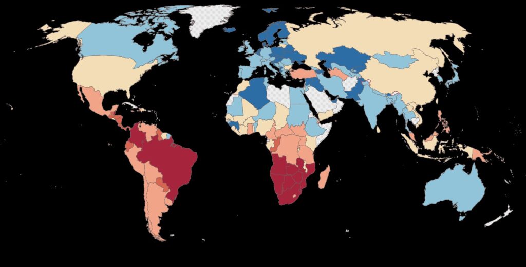
- Below 0.30 — Egalitarian (Nordics, Slovakia, Belgium)
- 0.30 to 0.40 — Moderate inequality (most of Europe, Canada, Japan, India)
- 0.40 to 0.50 — High inequality (United States, China, Russia)
- Above 0.50 — Very high inequality (South Africa, Brazil, Namibia)
The threshold values are not magical. A Gini of 0.40 in a poor country with low absolute incomes feels very different from a Gini of 0.40 in a rich country with generous safety nets — which is why no serious analyst uses Gini in isolation.
India’s Gini Coefficient
India’s inequality picture depends sharply on which dataset you use, what variable you measure (consumption, income, or wealth), and whether you survey or use tax records.
Consumption Gini (NSS / HCES): The Household Consumption Expenditure Survey 2022–23 produced a consumption Gini of roughly 0.27 in rural areas and 0.31 in urban areas — among the lowest in the developing world. This is the official figure most government press releases quote.
Income Gini: Estimated at around 0.40 in 2022, based on the India Human Development Survey, CMIE, and Periodic Labour Force Survey synthesis. Income Gini is always higher than consumption Gini because households at the top save more, smoothing their consumption.
Wealth Gini: This is where the picture turns stark. According to the World Inequality Database 2024 update, India’s wealth Gini sits at around 0.75, with the top 1 percent holding roughly 40 percent of total household wealth and the top 10 percent holding around 65 percent. The bottom 50 percent holds barely 6 percent of national wealth. The Thomas Piketty–Lucas Chancel team’s 2024 paper “Income and Wealth Inequality in India, 1922–2023” argues that India’s top-end inequality is now at levels last seen during the colonial era.
The divergence between a moderate consumption Gini and a very high wealth Gini is the single most important fact about Indian inequality — and a frequent UPSC essay theme.
Why Indian Consumption Gini Looks Low
Three reasons. First, NSS consumption surveys systematically miss the very rich, who refuse to participate or under-report. Second, free or subsidised in-kind transfers — PDS rice and wheat, free school meals, Ujjwala LPG, Ayushman Bharat coverage — were imputed into consumption for the first time in HCES 2022–23, mechanically lowering rural Gini. Third, consumption smoothing through dissaving, debt, and family transfers compresses the distribution even when income volatility is high.
Criticisms and Limitations
For a number that travels so widely, the Gini Coefficient has surprising weaknesses.
- Insensitive to where in the distribution change happens. A transfer of one rupee from the 95th to the 99th percentile worsens Gini exactly as much as a transfer from the 5th to the 9th percentile, even though the welfare implications are completely different.
- Single number, multiple distributions. Two countries with identical Gini coefficients can have very different shapes — one with a fat middle and thin tails, the other hollowed out in the middle. The Lorenz curve carries this information; Gini collapses it.
- Data sensitivity. Survey-based Gini routinely under-states inequality because top earners refuse interviews; tax-record-based Gini misses the informal sector. Combining both is hard.
- Does not distinguish income from wealth Gini. Mixing the two in commentary is a chronic error.
- No information about absolute poverty. A country can lower its Gini by making the rich poorer rather than the poor richer — Gini cannot tell you which happened.
Palma Ratio — The Modern Alternative
In 2011, Chilean economist José Gabriel Palma observed that across countries the income share of the middle 50 percent (deciles 5 through 9) is remarkably stable at around 50 percent, while almost all the variation in inequality comes from how the top 10 percent and bottom 40 percent share the remaining half. He proposed the Palma Ratio:
Palma = Income share of the top 10% / Income share of the bottom 40%
A Palma of 1 means the top 10 percent and the bottom 40 percent receive equal shares. India’s Palma ratio is roughly 2.5 for income and well above 5 for wealth. South Africa, Brazil, and the United States have high Palmas; Nordic countries sit close to 1.
The Palma ratio is increasingly preferred for inequality reporting because it is intuitive, sensitive to changes at the tails (where policy actually matters), and avoids the Gini’s insensitivity to where in the distribution change occurs.
Other Alternatives to Gini
- Theil index — decomposable into within-group and between-group inequality, useful for caste, regional, or rural-urban breakdowns.
- Atkinson index — incorporates a parameter for society’s aversion to inequality, allowing different ethical positions to be modelled.
- Decile and quintile ratios — ratio of top 10% to bottom 10%, or top 20% to bottom 20%, sometimes called the Kuznets ratio.
- Top income shares — what proportion of national income accrues to the top 1% or top 10%, popularised by the World Inequality Lab.
Gini and Policy Action
The Gini Coefficient is not just a measurement instrument; it shows up in policy debates over:
- Direct cash transfers vs in-kind subsidies — both reduce consumption Gini but differ in administrative cost and leakage.
- Progressive taxation — including a possible wealth tax, surcharge on the super-rich, and inheritance tax, all of which directly target the wealth Gini.
- Asset redistribution — land reforms, MGNREGA-funded asset creation, and Self-Help Group asset accumulation.
- Inclusive growth — the entire architecture of financial inclusion, Jan Dhan accounts, and the Pradhan Mantri Jan Dhan-Aadhaar-Mobile trinity ultimately aims at moving the Lorenz curve closer to the equality line.
The link to inflation is direct: when food and fuel prices rise — captured in the Consumer Price Index and the Wholesale Price Index — the poor lose a higher share of their real income, widening the Gini. The link to fiscal policy is equally tight: indirect taxes hit the poor harder than the rich, and a high fiscal deficit financed by inflationary monetisation acts as a regressive tax. On the structural side, the 1991 LPG reforms accelerated India’s growth but coincided with a sharp rise in top-end income shares, fuelling the wealth-Gini surge. Externally, large net outflows in the Balance of Payments can compress public investment and worsen distributive outcomes.
Frequently Asked Questions
Who developed the Gini Coefficient?
Italian statistician Corrado Gini in 1912, building on the Lorenz curve framework proposed by Max Lorenz in 1905.
What is the range of the Gini Coefficient?
Theoretically 0 to 1, where 0 means perfect equality and 1 means perfect inequality. In practice, real economies fall between roughly 0.20 and 0.65.
What is India’s current Gini Coefficient?
Consumption Gini is around 0.27 rural and 0.31 urban (HCES 2022–23). Income Gini is approximately 0.40. Wealth Gini is around 0.75 according to the World Inequality Database 2024.
How is the Gini Coefficient calculated from a Lorenz curve?
Gini equals the area between the line of perfect equality and the Lorenz curve, divided by the total area under the equality line — equivalent to twice the area between the two curves.
What is the Palma ratio?
The income share of the top 10 percent divided by the income share of the bottom 40 percent. Proposed by José Palma in 2011 as a more intuitive and policy-relevant alternative to Gini.
Why does India’s wealth Gini differ so much from its consumption Gini?
NSS surveys systematically miss the very rich, in-kind welfare transfers compress consumption distributions, and wealth is far more concentrated than income everywhere — but especially in India where the top 1 percent holds about 40 percent of household wealth.
What are the main criticisms of the Gini Coefficient?
It is insensitive to where in the distribution inequality changes, it can give identical numbers to very different distributions, and it carries no information about absolute poverty or top-share concentration.
What are alternatives to the Gini Coefficient?
Palma ratio, Theil index, Atkinson index, decile and quintile ratios, and top income shares (1%, 10%) reported by the World Inequality Lab.
Tell Google you want more of this.
Add Anantam IAS as a preferred sourceOne tap, and this site shows up more often in your own Top Stories, AI Overviews and AI Mode. Remove it any time.