

Introduction
Two diagrams sit at the heart of inequality and public finance discussions in UPSC economics: the Lorenz Curve and the Rahn Curve. Both are visual tools, both use a single curve to tell a story, and both show up repeatedly in Prelims factual questions and Mains analytical answers on inequality, taxation, and growth.
The Lorenz Curve plots how income or wealth is distributed across a population, giving us the widely cited Gini coefficient. The Rahn Curve plots the relationship between the size of government and economic growth, offering an argument about optimal government spending. Together they anchor two of the big debates of modern economics: how equal should outcomes be, and how large should the state be. This article walks through both, with diagrams, formulas, Indian data, and UPSC-specific pointers.
Quick Facts at a Glance
| Concept | Lorenz Curve | Rahn Curve |
|---|---|---|
| Proposed by | Max O. Lorenz, 1905 | Richard Rahn, 1986 |
| Purpose | Measures income/wealth distribution | Links government size to growth |
| Shape | Cumulative S-curve below 45 degree line | Inverted U |
| X-axis | Cumulative share of population | Government spending as % of GDP |
| Y-axis | Cumulative share of income | GDP growth rate |
| Key metric | Gini coefficient (0 to 1) | Growth-maximising government size |
| Perfect value | 45 degree line = perfect equality | Peak of curve = optimal state |
| India Gini (2021) | 0.357 income (World Bank) | NA |
| UPSC paper | GS3 Economy, Essay | GS3 Economy, Essay |
Background and Historical Context
Max Otto Lorenz, an American economist, introduced his curve in a 1905 paper for the Quarterly Publications of the American Statistical Association titled “Methods of Measuring the Concentration of Wealth”. Lorenz was 29 at the time and the idea was almost incidental to his dissertation, yet the curve he drew became the workhorse of inequality economics for the next century. In 1912 the Italian statistician Corrado Gini turned the visual idea into a single number, the Gini coefficient, by calculating the area between the Lorenz Curve and the line of perfect equality as a ratio of the entire triangle.
The Rahn Curve is younger and more political. Richard W. Rahn, then chief economist of the US Chamber of Commerce, popularised the idea in 1986 that government spending helps growth up to a point (rule of law, infrastructure, education) but hurts growth beyond that threshold because of taxation, regulation, and distortion. Scholars like Gerald Scully and Daniel Mitchell later refined it empirically. Though less settled than the Lorenz Curve, the Rahn Curve enters UPSC through the question of fiscal policy and size of the Indian state.
Both curves reflect the 20th-century effort to translate messy social questions into clean geometry so that policy makers could compare regimes, countries, and time periods at a glance. Their enduring power comes from that simplicity, even as critics rightly warn that a single curve cannot capture every dimension of inequality or state capacity.
Key Features and Diagrams
How the Lorenz Curve Works
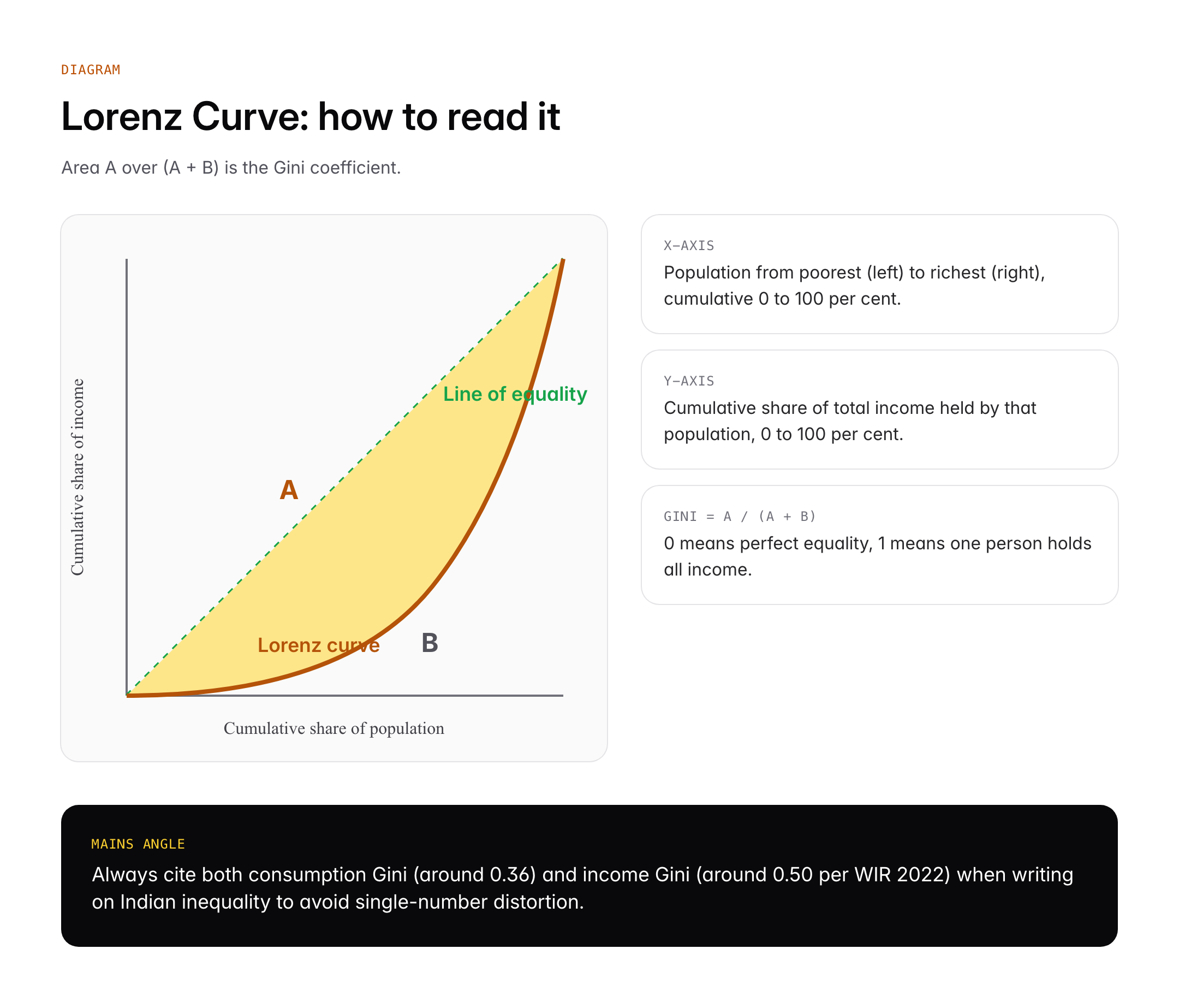
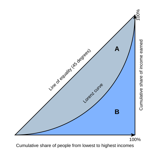
The Lorenz Curve plots cumulative share of population on the horizontal axis (from poorest on the left to richest on the right) and cumulative share of income on the vertical axis. Both axes run from 0 per cent to 100 per cent. If income were perfectly equally distributed, the bottom 20 per cent of the population would have 20 per cent of income, the bottom 50 per cent would have 50 per cent, and so on, giving a straight 45 degree line of perfect equality.
In any real economy, the poorest segments have a smaller share than their population share, so the curve sags below the 45 degree line. The greater the sag, the greater the inequality. A curve lying on the bottom and right axes of the box would mean one person holds all the income, which is perfect inequality.
The Gini Coefficient
The Gini coefficient converts the Lorenz Curve into a single number using the formula Gini = A / (A + B), where A is the area between the line of equality and the Lorenz Curve, and B is the area beneath the Lorenz Curve. The coefficient ranges from 0 (perfect equality) to 1 (perfect inequality). For policy conversations Gini is usually cited as a percentage, so India’s 2021 income Gini of 0.357 is often written as 35.7.
How the Rahn Curve Works
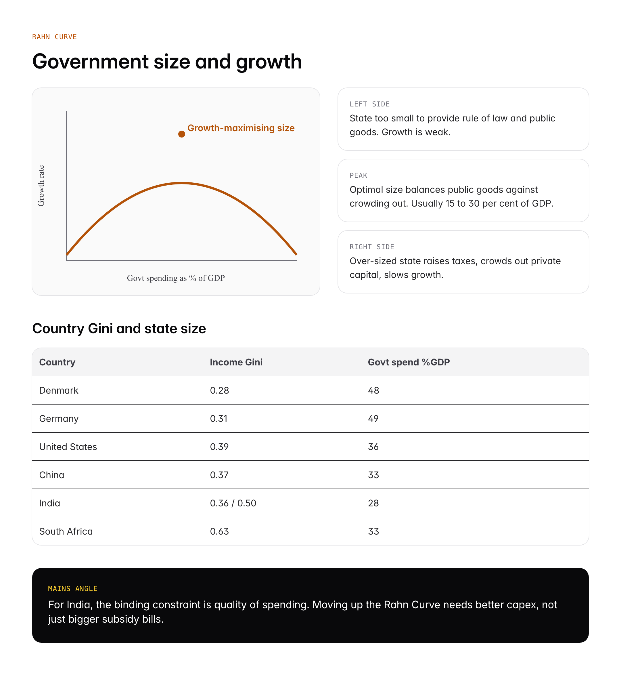
The Rahn Curve plots government spending as a percentage of GDP on the horizontal axis and economic growth rate on the vertical axis. The curve is shaped like an inverted U. At very low levels of government spending, growth is weak because there is no rule of law, no courts, no infrastructure, no basic education. As spending rises, growth accelerates. After a peak, further spending begins to crowd out private activity, raise tax burdens, and introduce deadweight losses, so growth falls.
Empirical estimates place the peak somewhere between 15 and 30 per cent of GDP for advanced economies, though the number is highly contested and depends on data, country sample, and specification. Scholars like Gerald Scully estimated about 23 per cent for the United States. The qualitative message, that government size matters for growth in both directions, is more robust than the specific number.
Significance for UPSC and General Knowledge
- Lorenz Curve anchors every Prelims or Mains question on income or wealth inequality.
- Gini coefficient is the key data point for comparing countries and over time.
- Rahn Curve links directly to GS3 debates on fiscal consolidation and public expenditure quality.
- Both tools support essays on growth, inequality, and welfare state design.
- India’s consumption-based Gini is lower than its wealth Gini, a distinction worth highlighting.
- Oxfam and World Inequality Lab reports on India rest on Lorenz-type analysis.
Detailed Analysis: Applying Both Curves to India
India’s income distribution has become a live debate since 2020. The World Inequality Report 2022, drawing on survey and tax data, estimated that the top 10 per cent of Indians capture 57 per cent of national income while the bottom 50 per cent hold only 13 per cent. Plotting those shares cumulatively gives a Lorenz Curve that sags sharply below the 45 degree line, with a Gini coefficient for pre-tax income of about 0.50 according to the same report. Earlier Consumption Expenditure Surveys suggested consumption Gini closer to 0.35, which is why published numbers differ. The consumption Gini understates inequality because the rich save a larger share of income than the poor.
The 2022-23 Household Consumption Expenditure Survey released by MoSPI in February 2024 showed monthly per capita consumption expenditure rising fastest for the bottom decile in rural India, suggesting that the rural Lorenz Curve may have moved slightly closer to the equality line over the decade, even as urban wealth concentration has grown. NITI Aayog’s Multidimensional Poverty Index reports that the headcount ratio fell from 24.85 per cent in 2015-16 to 11.28 per cent in 2022-23, a trend that complements but does not replace Lorenz analysis.
The Rahn Curve applies to India through the question of public spending levels. Government spending by the centre plus states runs at about 27 to 29 per cent of GDP, below the OECD average of 43 per cent. Whether India is to the left or right of the Rahn peak is contested. Advocates of higher social spending argue India is clearly below the peak, so more health, education, and infrastructure outlay should raise growth. Fiscal conservatives argue that the quality of spending matters more than quantity, that leakages and subsidies depress the growth return on each rupee, and that India is closer to the peak than the raw ratio suggests. The FRBM Review Committee under N K Singh made similar arguments in 2017.
A second Indian application is at the state level. States like Kerala and Tamil Nadu spend more as a share of state GDP on health and education and report higher human development indicators without obviously lower growth, suggesting they sit near the left side of their own Rahn Curves where more spending still helps. Other states with high spending on subsidies and salaries but low capex show a different pattern, consistent with being closer to or beyond the peak on productivity-reducing expenditure lines.
Comparative Perspective
| Country / Region | Income Gini (latest) | Govt Spending % GDP |
|---|---|---|
| Nordic (Denmark, Sweden) | 0.27 to 0.29 | 45 to 50 |
| Germany | 0.31 | 49 |
| United States | 0.39 | 36 |
| China | 0.37 | 33 |
| India | 0.35 (consumption) / 0.50 (income) | 28 |
| South Africa | 0.63 | 33 |
| Brazil | 0.52 | 43 |
The table shows that high-Gini economies can have either high or low public spending, so the Rahn and Lorenz frameworks answer different questions. Nordic countries combine large states with low inequality through universal transfers and strong labour market institutions. The US combines moderate state size with high inequality. South Africa combines moderate state size with very high inequality from persistent structural gaps. India’s consumption Gini is moderate but the income and wealth Ginis are high, reflecting large top-of-distribution concentration.
Controversies and Debates
The Lorenz Curve is uncontroversial as a descriptive tool, but its policy use is debated. Critics point out that a single Gini cannot distinguish between two Lorenz curves that cross, so the same Gini can mask very different distributions. The Atkinson index and Palma ratio are alternatives that weight the tails differently. In India, the gap between consumption and income Ginis raises questions about which to cite in public debate. Sources like NSSO Consumer Expenditure surveys and NFHS provide the granular data that Lorenz analysis demands.
The Rahn Curve is more contested. Critics argue that the peak position is unstable across time, country, and specification, so policy should not rest on a specific number. Scholars like Ha-Joon Chang argue that the curve ignores the composition of spending, the institutional quality of the state, and the sequencing of development. Supporters counter that even if the exact peak is unknown, the inverted U shape is a useful prior that warns against both minimal and bloated states. For UPSC, the safer framing is to treat the Rahn Curve as a pedagogical tool rather than a precise policy rule.
Prelims Pointers
- Max Otto Lorenz proposed the Lorenz Curve in 1905
- Corrado Gini gave the coefficient in 1912
- Gini coefficient ranges 0 (equality) to 1 (inequality)
- Perfect equality is represented by the 45 degree line
- Lorenz Curve is always convex and lies below the line of equality
- Atkinson index and Palma ratio are alternative inequality measures
- Richard Rahn proposed the Rahn Curve in 1986
- Rahn Curve is inverted U shaped
- X-axis of Rahn Curve is government spending as per cent of GDP
- Gerald Scully estimated the US growth-maximising government size around 23 per cent of GDP
- India’s consumption Gini was about 0.357 in World Bank data for 2021
- World Inequality Report 2022 estimated India’s top 10 per cent income share at 57 per cent
- MoSPI Household Consumption Expenditure Survey 2022-23 data was released in February 2024
Mains Practice Questions
Q1. Using the Lorenz Curve and the Gini coefficient, examine trends in income and wealth inequality in India since 1991.
- Draw the Lorenz Curve and explain Gini with a simple diagram.
- Cite data from WIR 2022, MoSPI HCES 2022-23, and NITI Aayog MPI.
- Distinguish consumption, income, and wealth Ginis with policy implications.
Q2. Discuss the Rahn Curve and its relevance for Indian fiscal policy debates.
- Explain the inverted-U and the idea of growth-maximising government size.
- Apply to India: centre plus state spending around 28 per cent of GDP.
- Assess whether quality of spending, not quantity, is the real binding constraint.
Conclusion
The Lorenz Curve and the Rahn Curve are among the most durable teaching diagrams in economics because they convert complex debates about inequality and state size into pictures any student can redraw from memory. The Lorenz Curve, together with its Gini coefficient, remains the default way to describe distributions, and every inequality report in India uses it either explicitly or implicitly.
The Rahn Curve is more provocative and less settled, but it is a useful reminder that governments can be both too small and too large from a growth perspective. For the UPSC aspirant, mastering the diagrams, the formulas, and the Indian data points turns these abstractions into ready-made material for Prelims factual questions, Mains analytical arguments, and Essay illustrations.
Frequently Asked Questions
What is the Lorenz Curve?
The Lorenz Curve is a graphical tool that plots the cumulative share of population (poorest to richest) on the x-axis against the cumulative share of income or wealth on the y-axis. A 45 degree line represents perfect equality and the extent to which the actual curve sags below that line indicates how unequally income or wealth is distributed.
Why is the Lorenz Curve important for UPSC?
The Lorenz Curve underlies every inequality measure used in UPSC GS Paper 3 and Essay, including the Gini coefficient, Palma ratio, and Atkinson index. Questions on income inequality in India, poverty reports, World Inequality Report findings, and welfare policy evaluations all rely on Lorenz-type analysis, making it a high-frequency concept across Prelims and Mains.
How is the Gini coefficient calculated?
The Gini coefficient equals A divided by A plus B, where A is the area between the Lorenz Curve and the line of perfect equality and B is the area under the Lorenz Curve. The result ranges from 0 (everyone has equal income) to 1 (one person holds everything), and is often expressed as a percentage from 0 to 100.
How is the Lorenz Curve related to the Rahn Curve?
Both are single-curve diagrams used to discuss public policy, but they answer different questions. The Lorenz Curve measures distribution of income within a society, while the Rahn Curve plots the relationship between government size and economic growth. A policymaker may consult both together to choose policies that raise growth and reduce inequality.
What is the Rahn Curve?
The Rahn Curve, proposed by Richard Rahn in 1986, is an inverted U-shaped graph that plots government spending as a percentage of GDP on the x-axis against GDP growth on the y-axis. It argues that growth rises with government spending up to a peak and then falls as further spending crowds out private activity and creates distortions.
What is India’s current Gini coefficient?
World Bank data estimate India’s consumption Gini at around 0.357 in 2021, while the World Inequality Report 2022 places the pre-tax income Gini closer to 0.50. The difference reflects whether the measure is based on household consumption surveys or on income and tax data, with income and wealth measures typically showing higher inequality.
What are the limitations of the Lorenz Curve?
A single Gini coefficient derived from the Lorenz Curve cannot distinguish between two distributions whose curves cross, so two societies with identical Ginis may have very different top or bottom income shares. Measures like the Palma ratio and Atkinson index address this by focusing on the extremes of the distribution where policy matters most.
How does the Rahn Curve apply to Indian fiscal policy?
Indian centre and state government spending totals about 28 per cent of GDP, below the OECD average. The Rahn Curve framework suggests India could still gain growth from higher spending on public goods like health, education, and infrastructure, provided the quality of expenditure improves. The FRBM Review Committee highlighted similar points in 2017.
Tell Google you want more of this.
Add Anantam IAS as a preferred sourceOne tap, and this site shows up more often in your own Top Stories, AI Overviews and AI Mode. Remove it any time.